Custom Woven Labels for Clothing: Size, Wording and the Proof You Approve Before Production
14 October 2026
Trend Report
Knitwear colour trends AW26/27 arrive in Prato showrooms with an unusually clear internal logic: the season assigns each noble fibre the palette it physically renders best. Kid mohair carries the saturated jewel story, baby alpaca owns the undyed naturals, and cashmere blends hold the neutral spine underneath both. For a buyer, this fibre-to-palette mapping is a gift, because it turns colour planning from taste into structure. This article works through the map in buying order; the fibres themselves, their prices and their formats, are covered in our Prato wholesale guide to kid mohair, baby alpaca and cashmere blend knitwear.
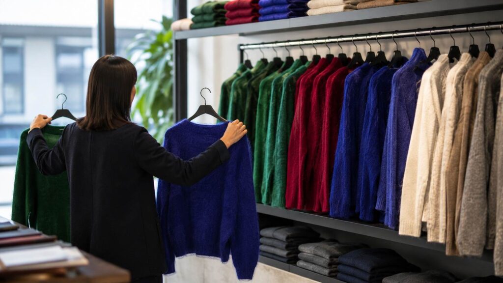
Colour deserves this much planning because in knitwear it is the first purchase trigger. Customers cross a shop toward a colour before they know the garment’s shape, price or fibre; the hand-feel and the ticket only ratify a decision the eye already made. A knitwear wall whose colours are chosen fibre by fibre and arranged with intent therefore does measurable selling work before staff say a word, which is why colour discipline shows up directly in full-price sell-through.
The broader Italian wholesale palette for the season, tracked across categories in our report on the AW26/27 colour palette across Italian wholesale, shows two poles strengthening simultaneously: rich saturation on one side, quiet earth on the other, with the tired middle ground of greyed pastels receding. Knitwear expresses both poles more vividly than any woven category because dye behaves differently in dimensional fibre, deepening in the pile of a mohair knit and glowing across an alpaca surface.
For buyers the practical reading is permission to be decisive. The season does not reward hedged, in-between tones; it rewards a wall where the colour zone is unmistakably colourful and the calm zone unmistakably calm. Showrooms have organised themselves accordingly, and a live session in early autumn will present the two stories almost as separate rooms, which makes the buying conversation unusually efficient this year.
One structural note on how the district itself handles colour: because pronto moda collections refresh every three to four weeks, the palette is not a September decree but a living sequence, with tones deepening and accents arriving as the season advances. Buyers therefore see the map twice, once in the autumn main buy and again through reorder windows, and the strongest colour walls in independent retail are built across both viewings rather than frozen at the first.
Emerald, ruby, sapphire, amethyst and deep teal form the mohair story of AW26/27, with emerald currently the district’s visible front-runner. The fibre justifies the assignment: mohair’s flat-scaled surface reflects light through the dye, producing saturation with luminosity that flat knits render as mere darkness. A jewel mohair crewneck reads from across a street, which is exactly the job description of the boutique’s colour zone in the dark months when windows must work hardest.
The buying craft is depth in one hero tone, shallow support in two others, and honesty about your market’s temperament: northern European customers are currently rewarding emerald and teal, Middle Eastern buyers lean ruby and amethyst, and North American sell-through splits by city more than by trend. A secondary softness of powder pink and butter yellow exists for markets that resist deep winter colour, but it should borrow units from the support tones, never from the hero, whose depth is what makes the whole zone credible.
Format matters as much as tone inside the colour zone. The hero jewel belongs on the highest-visibility silhouette, usually the oversized crewneck, where the colour has maximum surface to work with; support tones perform better on smaller-surface formats such as vests and cropped cardigans, where their job is variety rather than announcement. Reversing this, burying the hero tone on a vest while a support colour occupies the biggest knit, is a subtle composition error that flattens the whole zone’s impact for no saving.
Alpaca’s AW26/27 story is barely a dye story at all. The fleece grows naturally in ivory, oat, camel, taupe and soft brown, Prato’s mills increasingly use those shades as they come, and the resulting garments align exactly with the quiet luxury direction that continues to govern the season’s upper price bands. An undyed camel coatigan carries three selling arguments in one garment: the tone flatters nearly everyone, the naturalness is a sustainability sentence staff can say honestly, and the palette cannot date within the season because it was never fashionable in the first place.
Composing the calm zone is an exercise in tonal spacing rather than colour choice: ivory through oat to camel to taupe to brown, each step visible, no two garments fighting for the same shade. Buyers should resist the urge to inject a fashion colour here; the zone’s commercial function is to be the dependable counterweight to the mohair wall, the place where the customer who found the emerald too loud finds her answer, and any interruption of its calm costs both zones their contrast.
Wholesale pricing gives the calm zone a further advantage worth naming: undyed and minimally dyed alpaca pieces sit in the same 22 to 45 euro band as their dyed equivalents, so the naturals story costs nothing extra to tell. The value arrives at the other end, in longevity, since a camel or oat garment unsold in December remains fully priced in February and often transfers intact into an early-spring rail, an afterlife no fashion colour can offer and a quiet subsidy to the whole order’s margin.
Beneath both zones, the cashmere blend basics hold the permanent spine, ivory, grey melange, camel, navy and black, unchanged in role from every season because their job is combination, not statement. The spine’s discipline is what licenses adventure above it: a customer buys the sapphire mohair precisely because the navy basic beneath it makes the purchase wearable. The AW26/27 nuance is warmth, with the greys of recent winters ceding shelf share to camel and soft brown as the default neutrals, a shift worth reflecting in reorder proportions rather than in wholesale replacement.
Mid-season brings the palette’s second act. From late October the showrooms introduce festive depth, bordeaux and true deep red foremost, alongside the first metallic-threaded knits for the party weeks. These accents are designed as top-ups, not foundations: bought in November through the district’s three to four week refresh cycle, sold through December, and never deep enough to survive into January as regret. A buyer who leaves them out of the autumn order and budget-lines them for a November reorder is using the pronto moda calendar exactly as the mills intend.
Metallics reward one specific check on camera before ordering: how the lurex or metallic thread behaves against skin, since scratchy party knits generate January returns as reliably as they generate December sales. Showrooms carry both soft-thread and economy versions at similar prices, the difference is entirely in the yarn engineering, and thirty seconds with the garment against the inside of a wrist during the live session separates them decisively.
Assembled, the AW26/27 knitwear wall has a legible architecture: a saturated mohair colour zone that pulls customers in, an alpaca calm zone that catches those the colour releases, a neutral spine that makes everything above it purchasable, and a rotating accent shelf that keeps the whole arrangement visibly alive through the season. Proportions of roughly one quarter colour zone, one quarter calm zone and half spine suit most independent boutiques, tilting colourward only where a shop’s identity and window traffic justify it.
Colour is also the strongest argument for buying live rather than from photography, because dye lots, screen calibration and lighting conspire to make remote colour judgement unreliable in exactly the saturated tones this season leads with. In a live session the garments are held to window light, compared against each other and against reference pieces, and the emerald you approve is the emerald that arrives. The session mechanics, from initial interview to consolidated delivery, are described on our fashion sourcing and purchasing service page.
Knitwear colour trends AW26/27 ultimately ask the buyer for one quality: commitment. The season’s palette is structured, fibre-mapped and forgiving of discipline, punishing only of hedging. Choose the hero jewel, space the naturals, warm the spine, calendar the accents, and the wall will do what well-planned colour always does in winter retail, which is sell the shop before anyone touches a sleeve.
Italian fashion supply, curated and delivered to your inbox.
How can we assist?
See our services